Soak Magazine
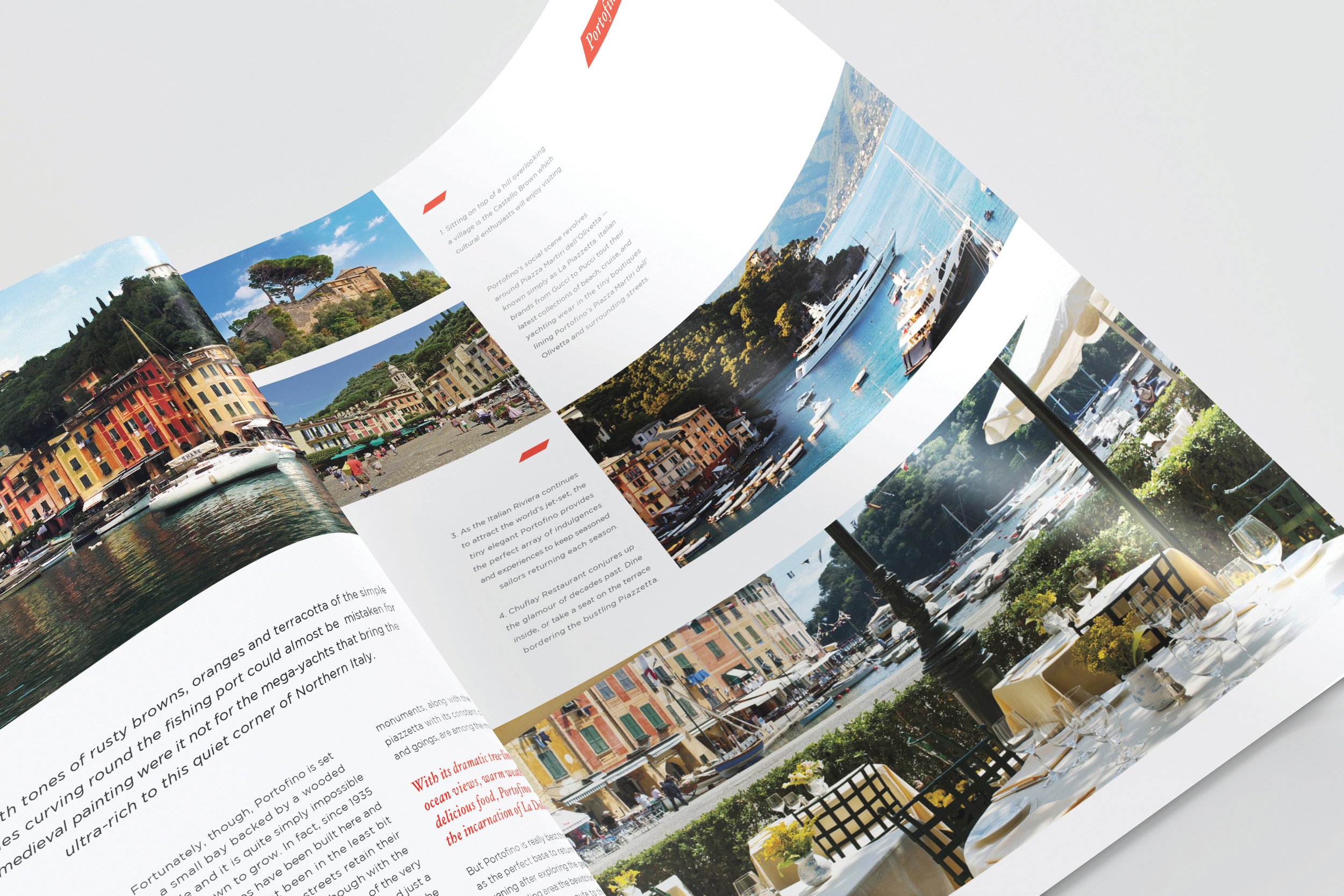
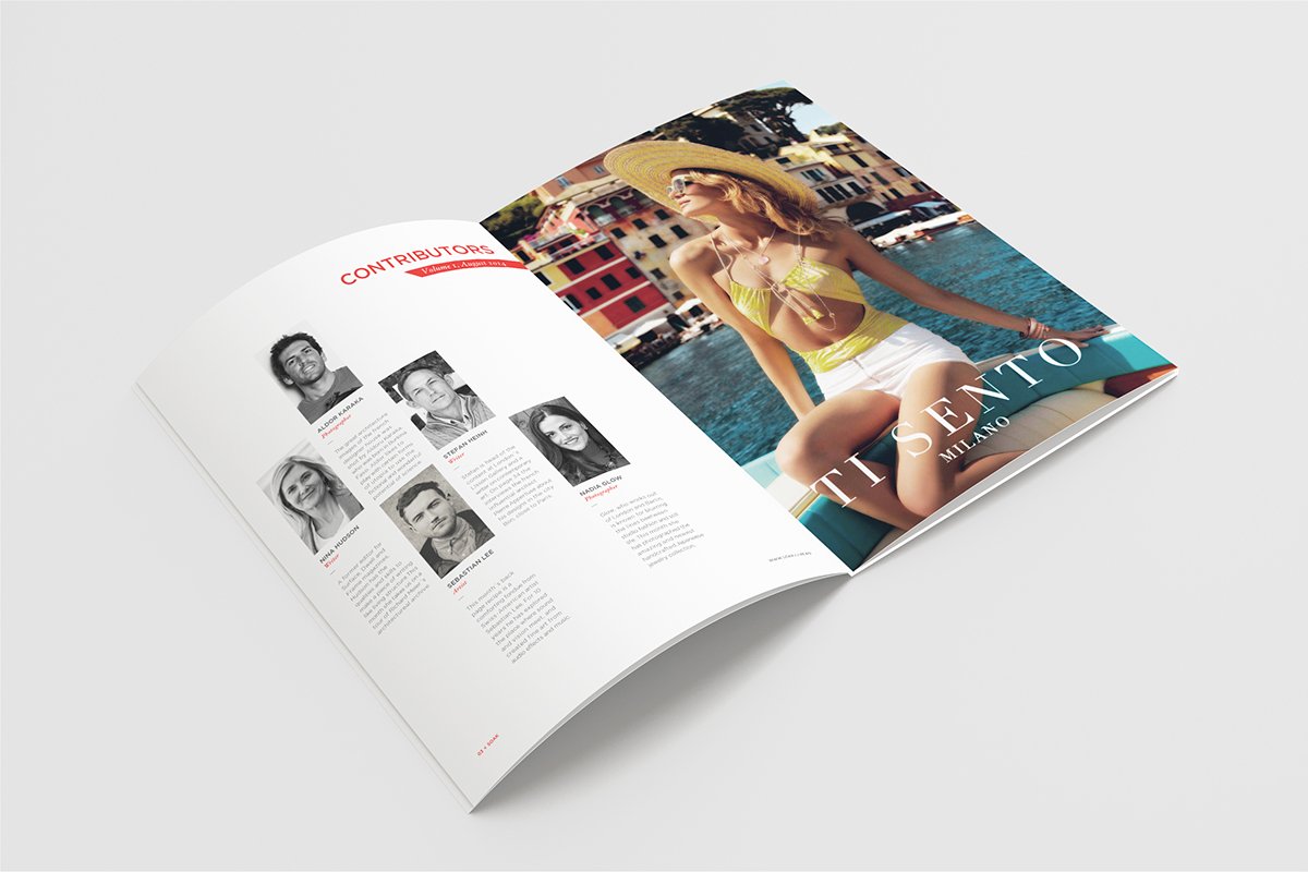
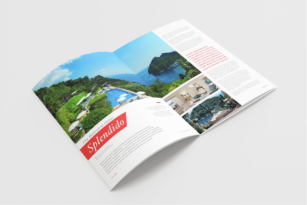
The brief aimed to create a lifestyle/design/culture magazine about Portofino in Italy. The assignment involved everything from developing the brand and the masthead, designing a cover image, creating a vector map, and sourcing appropriate images and text with a focus on layout, typography, and attention to detail.
I named my magazine “SOAK”, as I wanted the magazine to emphasize a reader immersing and “soaking” themselves fully in the content of the article. I used turquoise and terracotta as the primary color palette, with a layout similar to pieces floating in the water from above. I used elements from the logo for the article layouts. The Cover Image is a collage photo I created of many different photos, that depict the known aspects of Portofino; like the red reefs, the harbor, the blue water, and the martinis.
Flip through the full magazine here, or see it showcased in the photos below.


