Cadbury
The chocolate brand Cadbury was one of the brands I was delighted to work on while stationed in Melbourne Australia working for the design studio Brand Society. From Cadbury Roses to luxury brand Cadbury Coco, to concept development for new types of chocolates; they were all delicious to work with.
Cadbury Roses
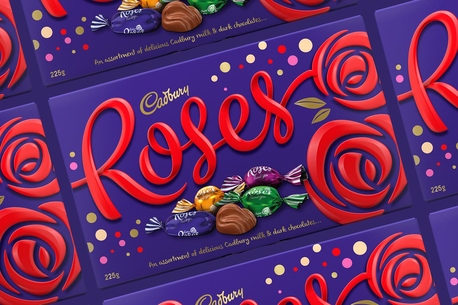
Roses are red.. Or are they chocolate brown?
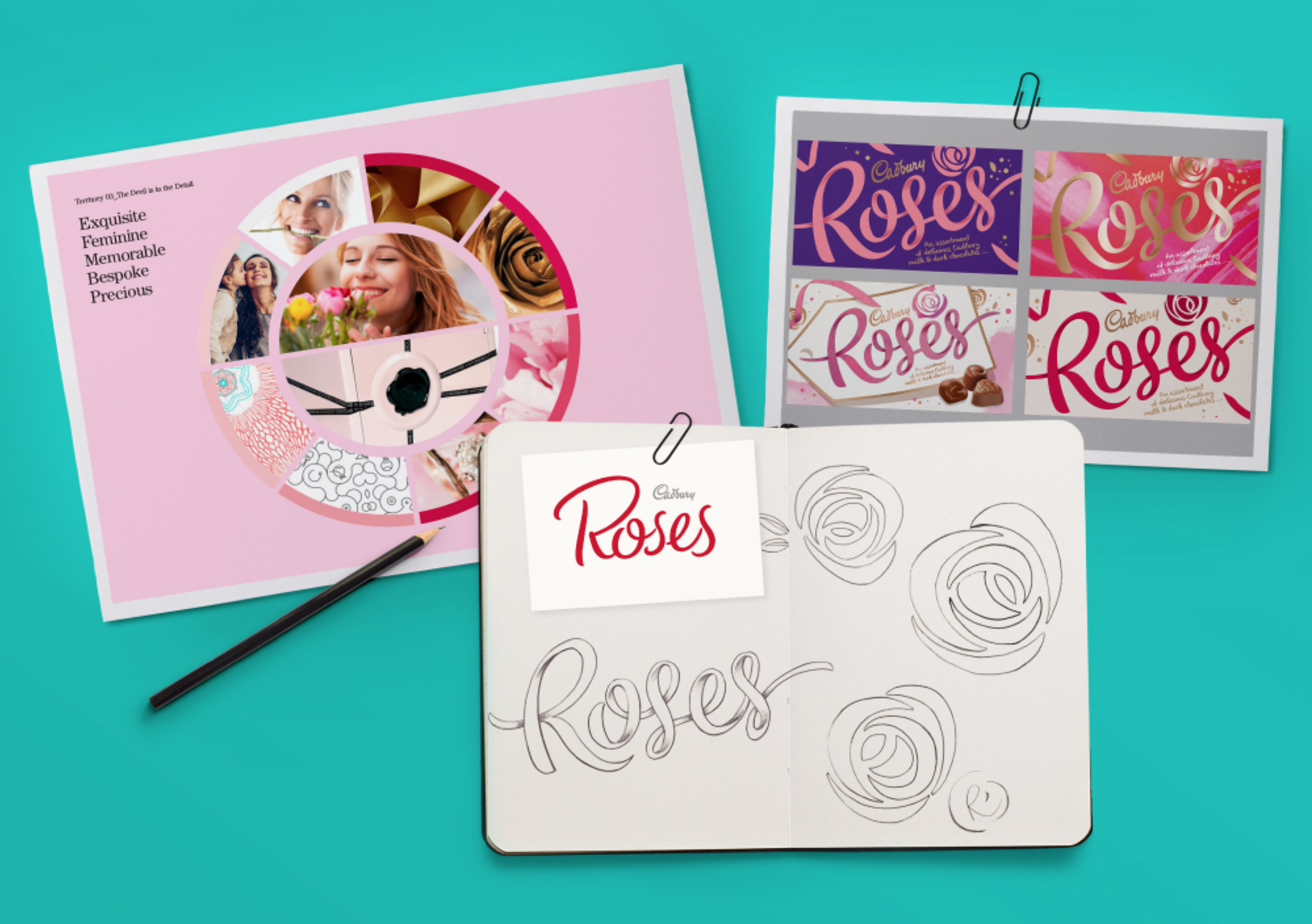
The chocolate brand Cadbury Roses has been a favorite in Australia for decades. Brand Society was the lucky studio that got to redesign it completely from its old stale and grey look.
I was also grateful to get to work on the Core Roses Packaging design along with the wrappers that the chocolate goes in. It´s safe to say, I ate a lot of these while working on the project.


Mothers´s Day Limited Edition
The goal of the brief was to create a feminine and gift-worthy limited edition design for Cadbury Roses, launched in relation to Mother’s Day. Along with working on the package design, I was tasked to create a design for the in-store tower.
Mothers´s Day Limited Edition 2
Another feminine and gift-worthy limited edition design for Cadbury Roses was needed. The theme was to be ultra feminine! I therefore used an embroidered texture design integrated into the rose, with a ribbon in the corner to bring out the gift-worthy ness. I also used a daring hot pink background to make it stand out on the shelves.
Cadbury Coco Special Editions
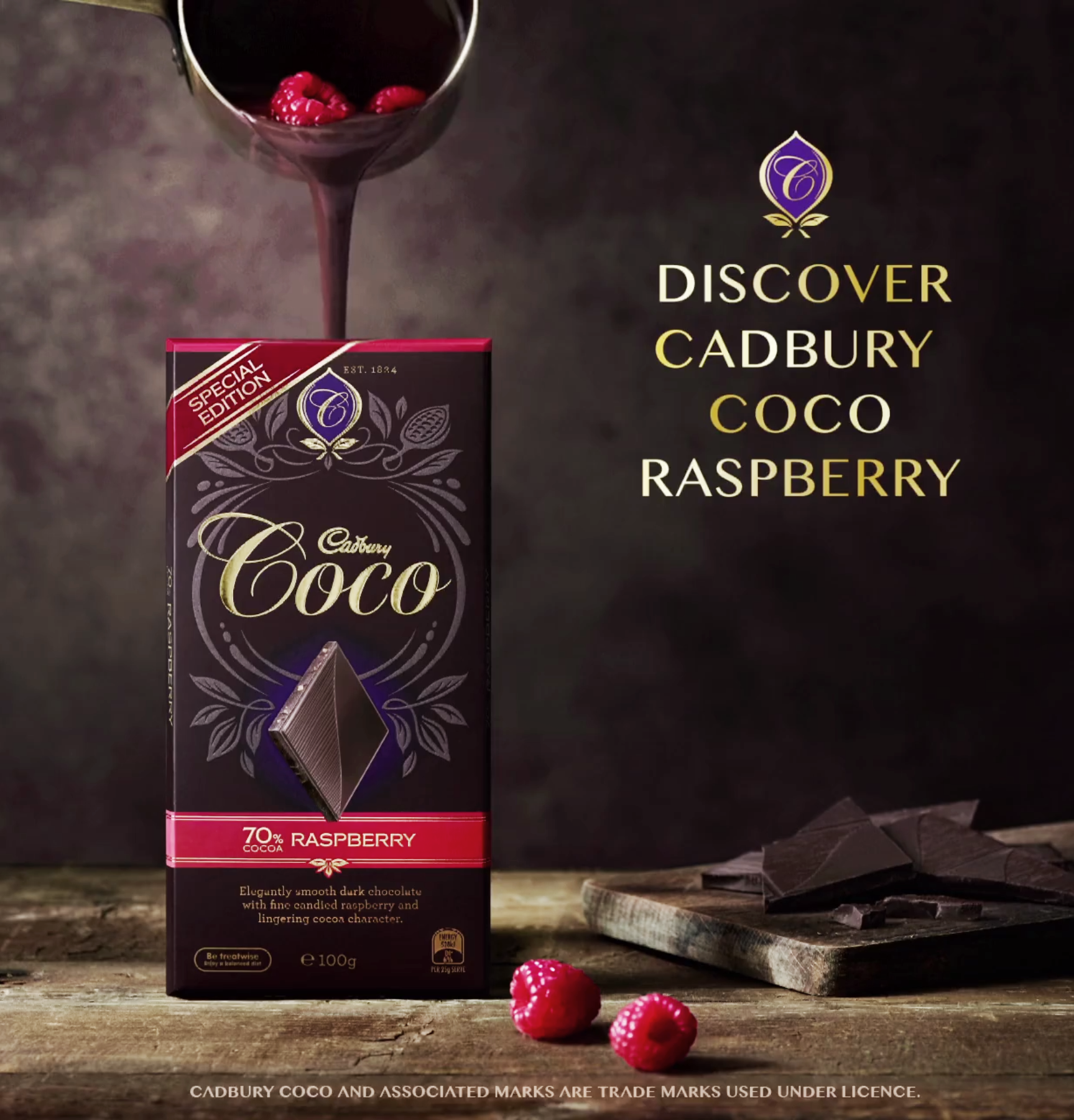
Cadbury Coco required new colors for their Dark Espresso and Raspberry flavors as well as a “Special Edition” callout.


Cadbury Valentine´s Tower
Cadbury Coco wanted to do something special for their in-store towers advertisement for Valentine’s, and I was asked to create something romantic, yet luxurious. The result was this Cadbury Coco heart, made up of their design elements.
Cadbury Scorched Peanuts
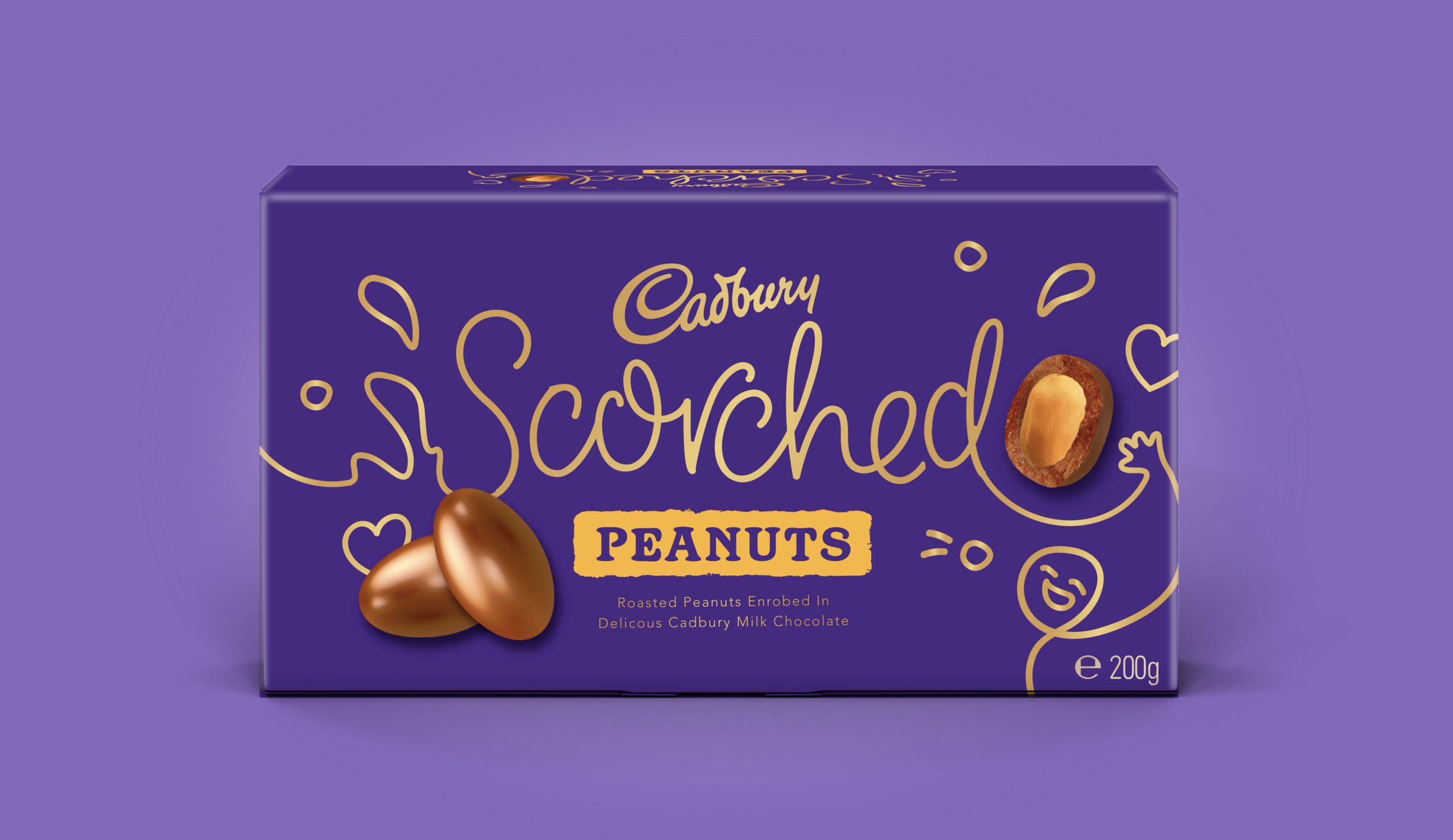
The brief required a more gift-worthy and contemporary design for their scorched chocolate range. This was the playful, lifestyle-themed concept we supplied, where the design is meant to reflect upon the micro-moments in life when you decide to throw a little snack in your mouth.
This design concept was created in collaboration with strategic director Nina Kelly and typographer Keith Morr.


